Client
Hamilton County Board of Elections
Services
User Experience Research, User Testing, Website Design
Year
2019
Finding where to vote, how to register, or how to vote can be challenging for eligible voters. The redesigned Hamilton County Board of Elections (BOE) website better serves voters by streamlining essential tasks and processes, simplifying information, improving usability and accessibility, and giving the BOE a modern look.

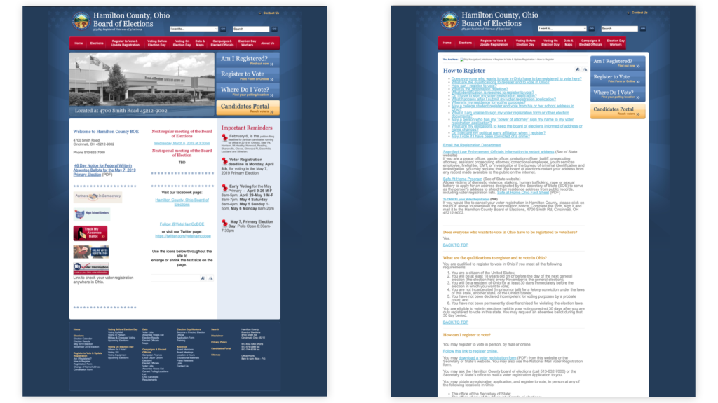
The original site was not mobile-friendly despite a large percentage of traffic accessing the site on their phones. A prevalent pain point of users was that it was difficult and unclear to find out how to vote, where to vote, etc.
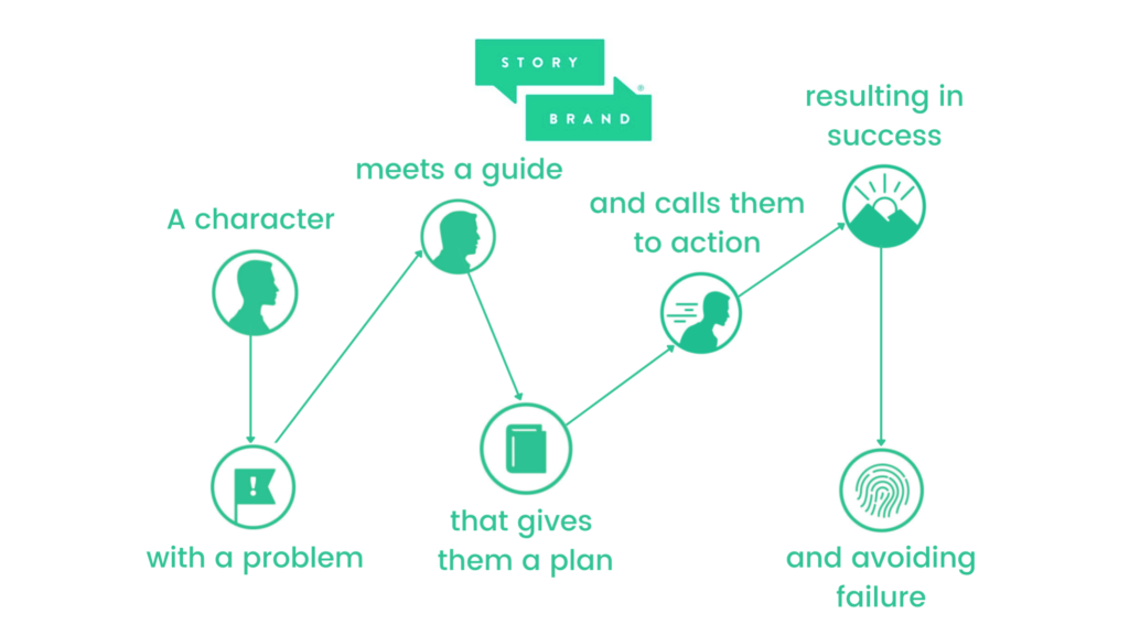
To kick off the discovery phase, I partnered with our copywriter as she interviewed the clients and followed the StoryBrand 7-step framework for creating clear marketing messages. We determined there were actually three main audience types: Voters, Elected Officials, and The Press.
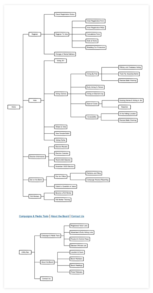
This created the need for multiple calls to action, even just for the Voters due to their varying goals and tasks they needed to complete on the site. We then began the process of simplifying an increasingly complicated user flow and sitemap.
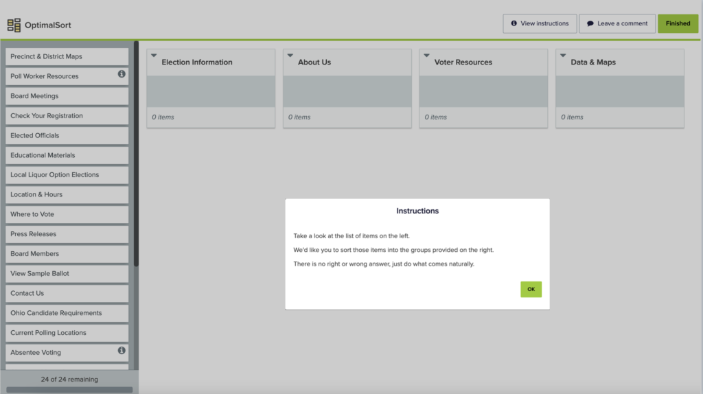
Integral to the design process for this project was user research and strategizing the structure and user flow of the site. Before attempting any designs, I created a new sitemap that went through testing and many iterations and revisions with the client before landing on the final option.
After creating an initial revised sitemap, I conducted multiple card sort studies and continued to adapt and refine the sitemap structure and page titles.
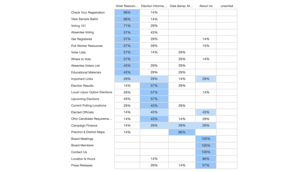
Card sort study round #1: Still quite a bit of confusion for some pages/content as testers guessed which “bucket” it belonged in or that made sense to them.
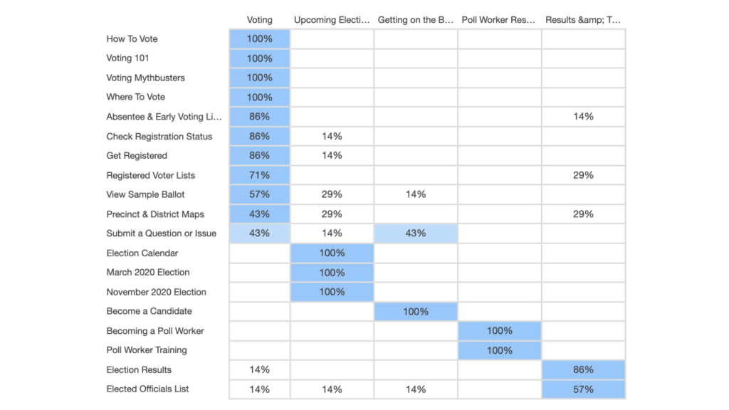
Card sort study round #2: began to see greater consistency and alignment from all testers on the organization of the site structure and naming conventions of pages.
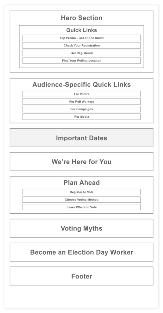
I also created a homepage priority guide (capturing the primary messaging and CTAs for Voters, as well as callouts for the secondary audience of Poll Workers) to guide the direction of all homepage design concept options. The hierarchy of a priority guide is based on relevance to users, with the content most critical to satisfying user needs and supporting user (and organization) goals higher up.
Both the sitemap and priority guide process helped promote a content and user-first approach to design – a must for a site like the Hamilton County Board of Elections.
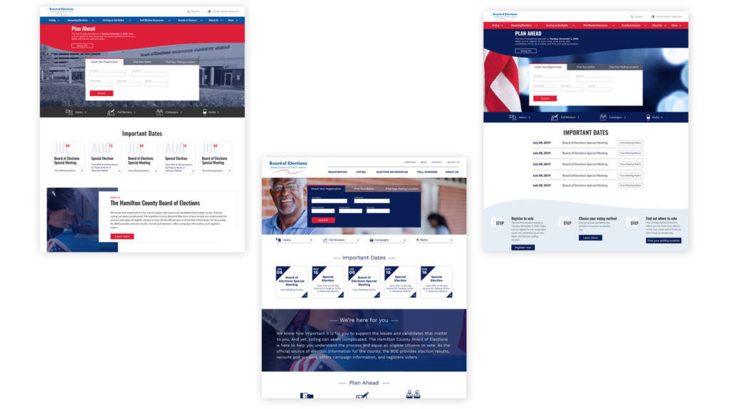
After conducting a Design Preferences presentation with the client (2-3 competitors and 5-6 best-in-class examples to get their gut reaction to different visual approaches and make sure we were on the same page), I presented three different homepage concepts before settling on the final design approach to the site.
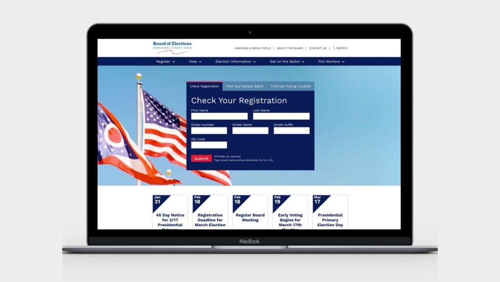
Similar to an airline or travel site whose users will be coming to perform one of several different goals, the BOE site highlights front-and-center the three main actions their voters come to the site for: checking registration, finding a sample ballot, and finding a polling location.
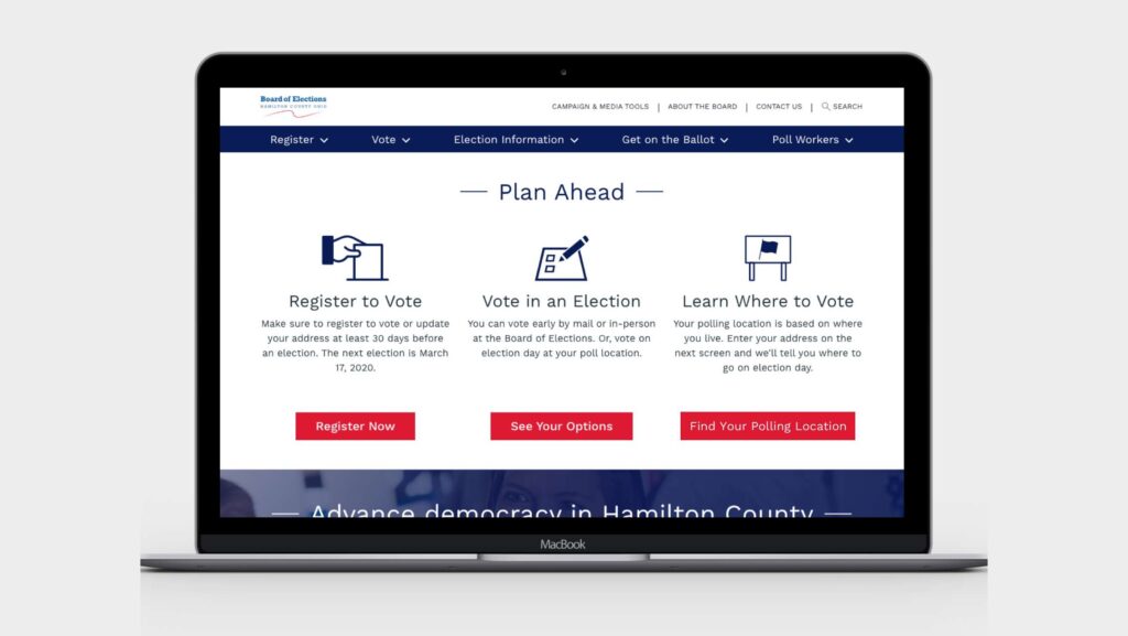
The BOE site required more than one primary call-to-action. Multiple types of users (including voters, campaign managers, and media) needed multiple options. So the design and content were pared down to focus on the needs of the primary target audience: voters.
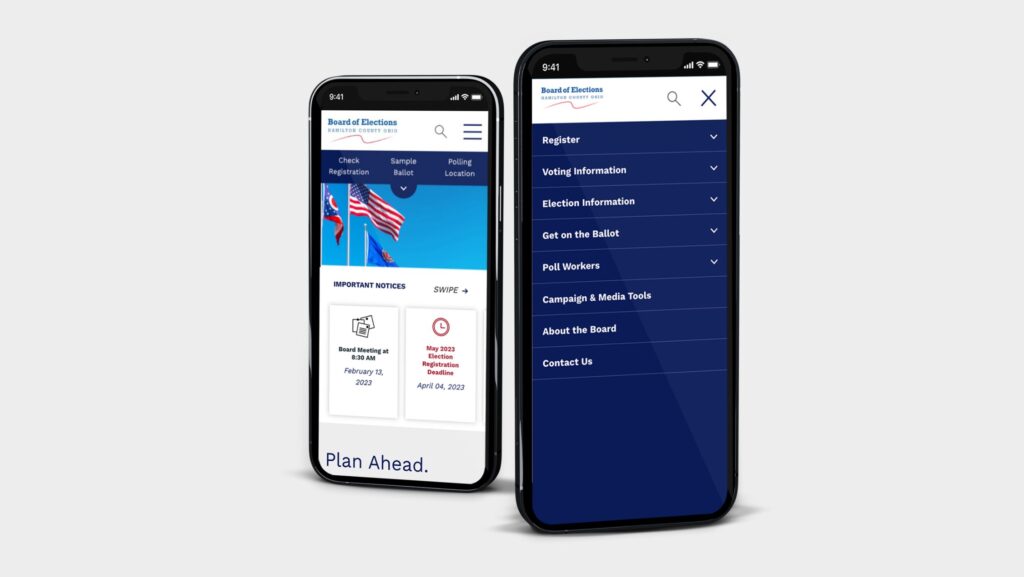
Unlike the previous site, the new BOE site is fully responsive and optimized for viewing on a range of mobile devices. This ensures that voters countywide can access information, regardless of device type, to make a difference and participate in democracy.
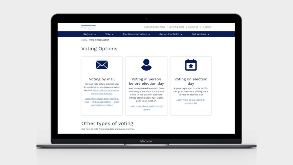
The information architecture and overall page organization were finessed so that the new site provides clear and easy-to-find information on voting options, voter registration, the voting process, and how to find your polling location and sample ballot.
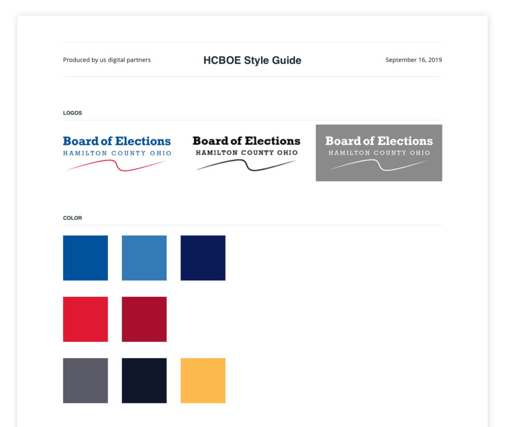
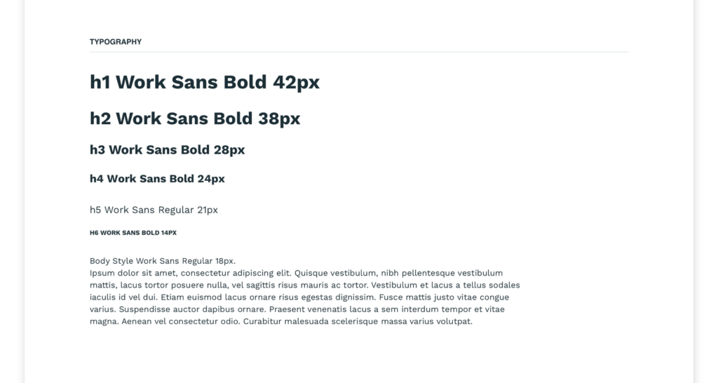
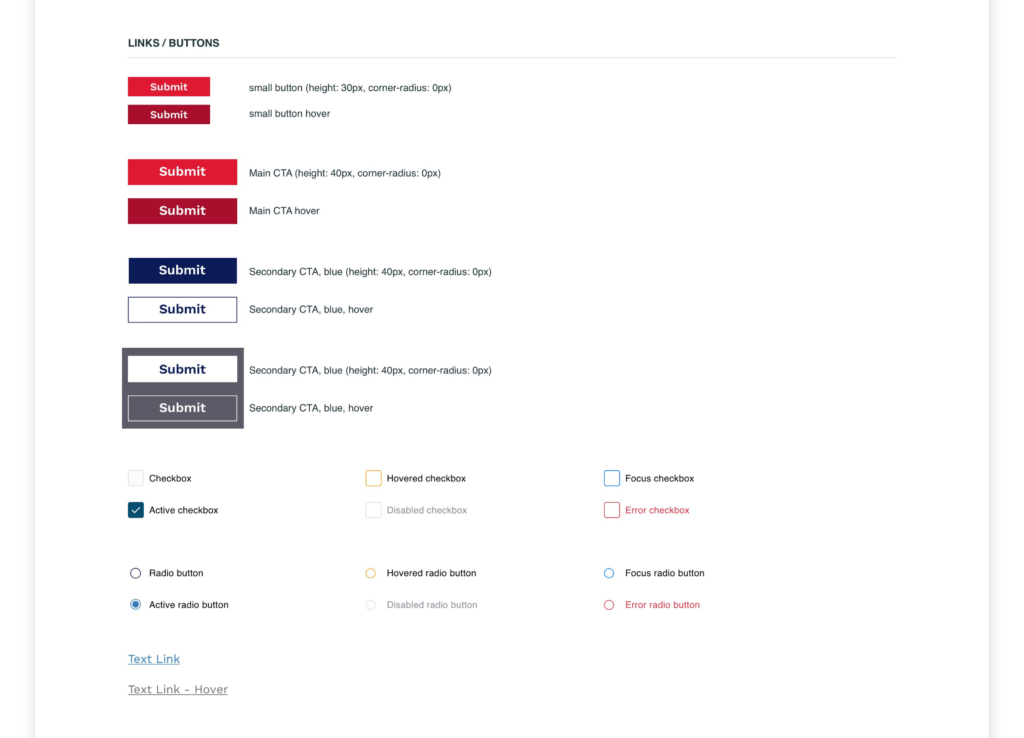
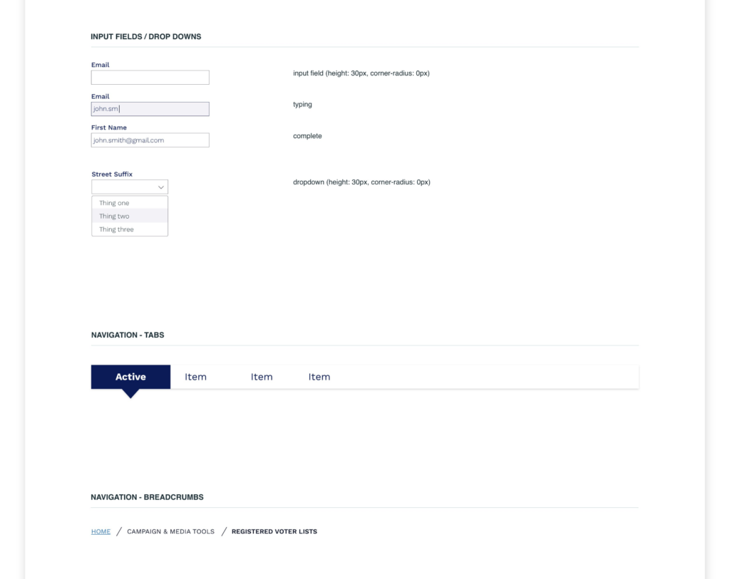
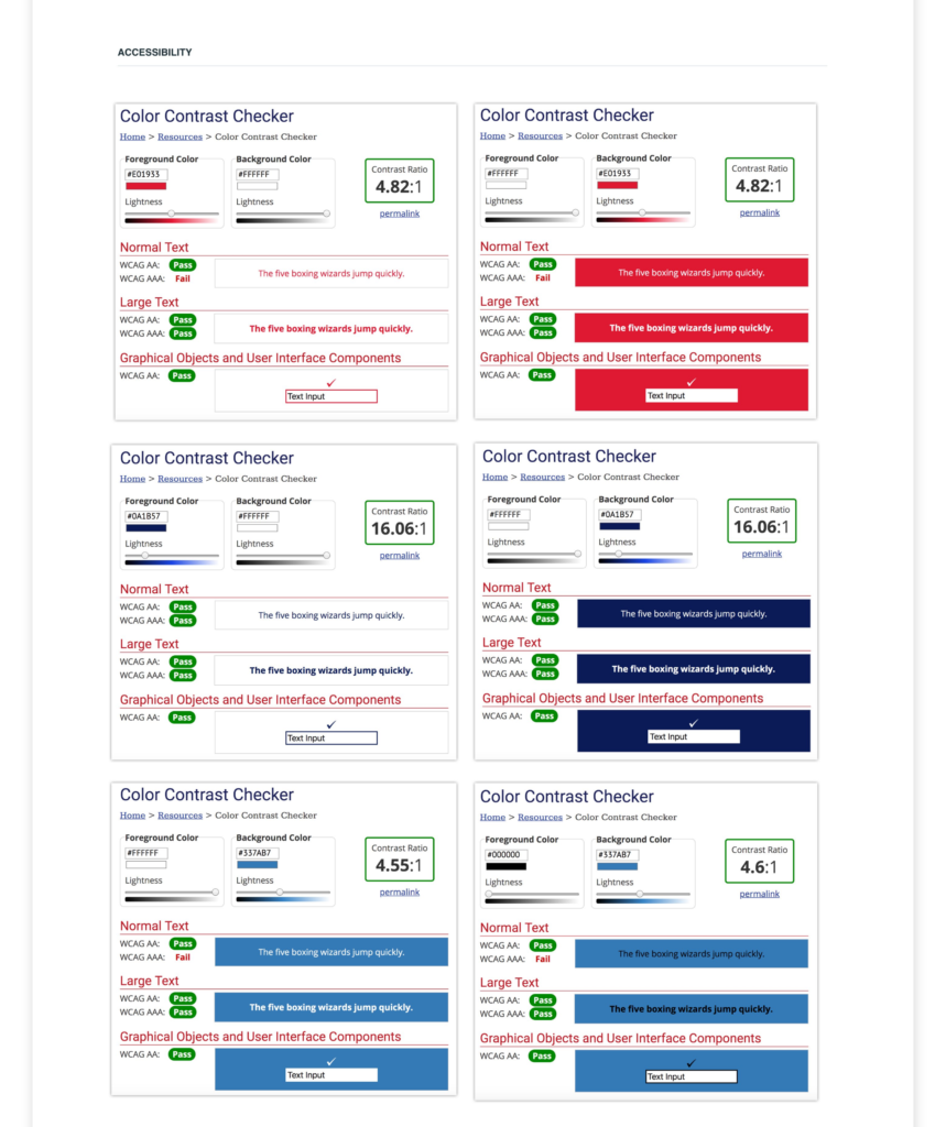
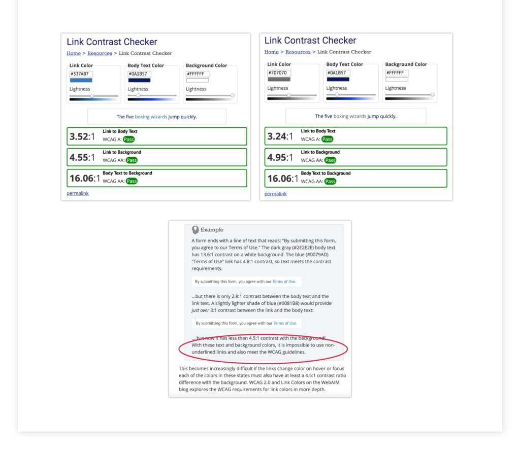
The final piece of this project was a style guide for the developer and the client. Basics such as logo variations, colors, and fonts were included, as well as guidance on approved colors according to the WCAG 2.0 color contrast ratios.