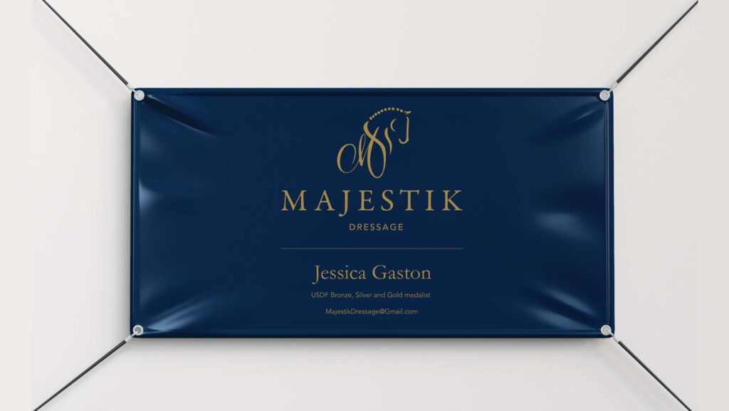
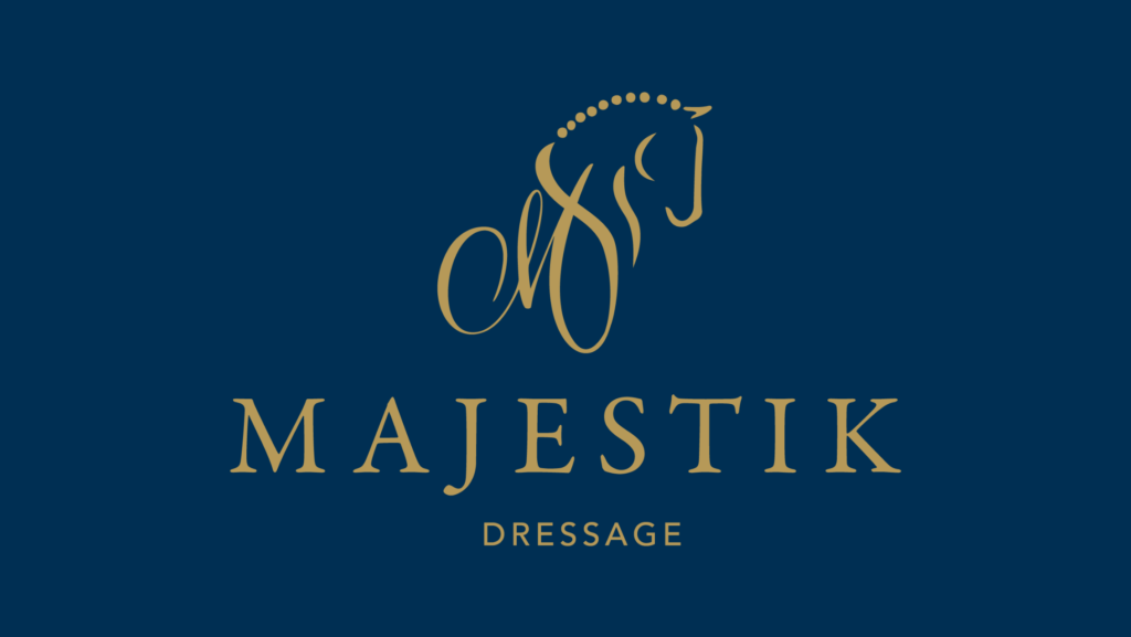
Created a brand identity for a Grand Prix dressage rider offering horse training and riding lessons. Client’s business name comes from the black gelding who helped take her to Grand Prix status, Majestik.
Client needed branding elements to market herself more effectively at horse shows and on social media. She requested a logo that abstractly represented elements of horses with a sweeping, classical font.
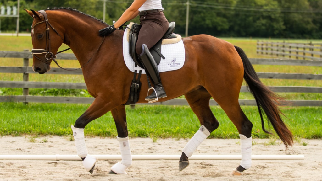
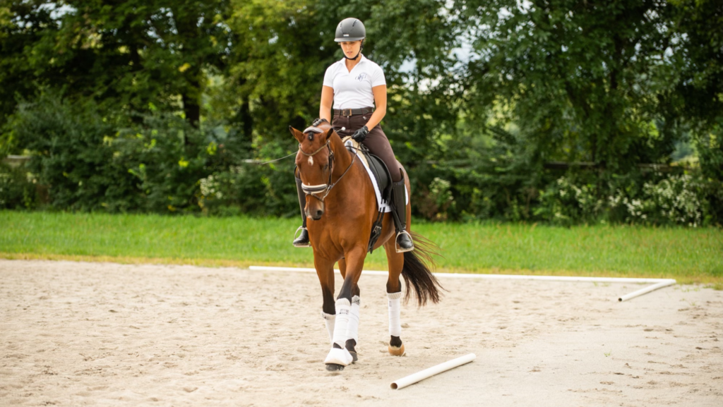
Dressage training was originally for war horses and to this day is included in the Olympics. This graceful event evaluates the movement, athleticism, and obedience of the horse and its harmony with the rider.
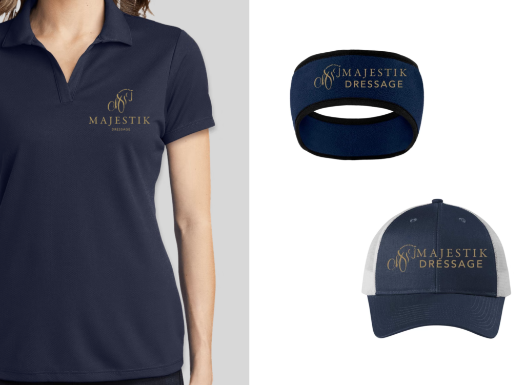
The final Majestik Dressage logo incorporates an abstract horse’s head conjoined with a scripted, flowing “M” to reflect the fluid movements of dressage and the way horses used to go “dancing into battle”. The primary logo uses deep blue with gold to symbolize the elegance and rich history of the sport. Client also received a mini brand guide with information on logo variations and brand font styles.
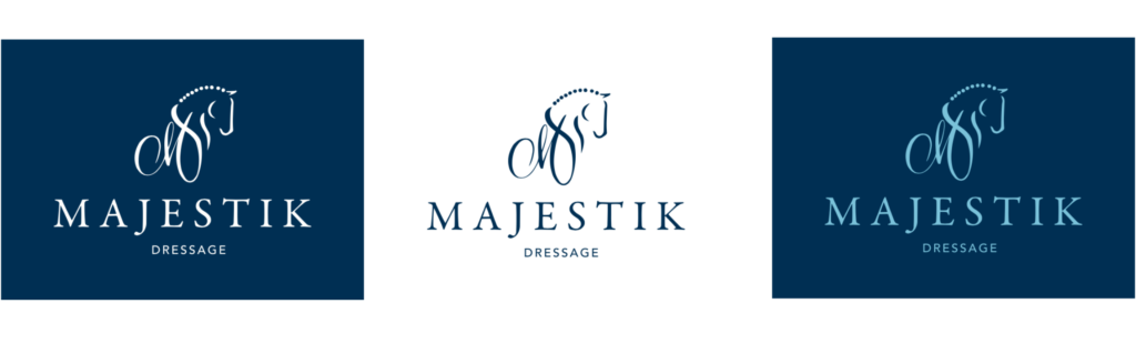
Primary logo layout and alternate color options.
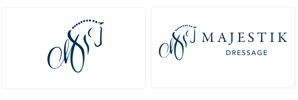
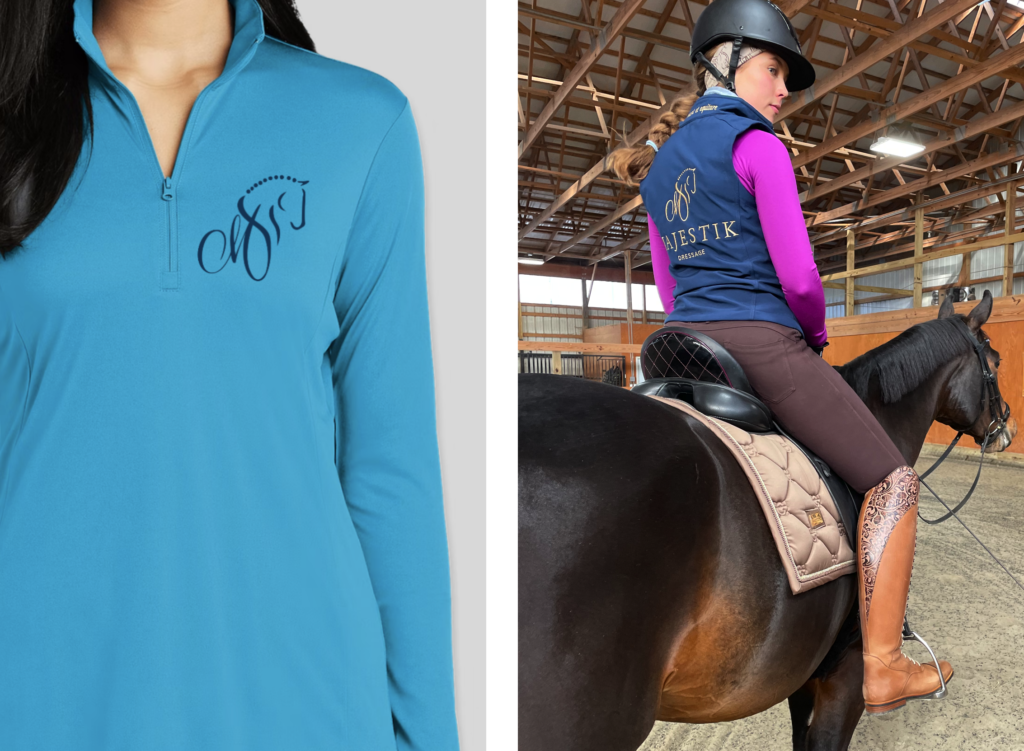
Two alternate logo variations for different aspect ratio requirements on brand collateral and garments.